Optica Normal
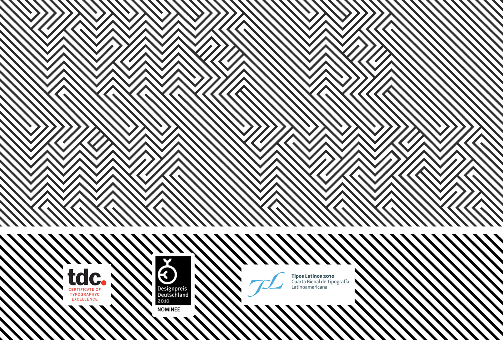
OPTICA Normal es una fuente tipográfica construida con la ayuda de líneas ortogonales ensambladas en un orden fijo. En este juego óptico podemos percibir una textura de patrón pero si analizas las direcciones de línea verás el texto dentro. Este tipo funciona mejor en tamaños grandes. OPTICA Normal es un homenaje al arte óptico del artista colombiano Omar Rayo.
2008 – Proyecto destacado por el blog ilovetypography.com
2009 – Proyecto presentado por typographyserved.com
2009 – Certificado de excelencia por el Type Directors Club
2009 – Review en fontfeed.com
2010 – Nominado al Designpreis Deutschland 2010
2010 – Certificado de excelencia en la Cuarta Bienal Tipos Latinos
Compra esta fuente tipográfica

Optica Normal $35.00 usd

Optica Negative $35.00 usd

Optica Pack $60.00 usd
JUGDGE’S CHOICE | RICHAR KEGLER | Type Director Club 2009 |
The premise of Excellence in Type Design made the judging of the 165 entries difficult. There were many designs that demonstrated skill and understanding of type design to a level of excellence but were still eliminated for various reasons. Perhaps the field of type design grows so much every year that the cumulative pool of designs make the truly unique and exceptional harder to reveal themselves. To contribute something new to such a studied and focused field risks failure or redundancies at every turn.
This entry was thought at first to be possibly a put-on. It wasn’t until several hours of judging and returning to this design bleary-eyed that the letters finally emerged for me. Before then, it was simply an engaging piece of op art. The seamless lockup as a solid field of intersecting lines at 90-degree angles, even in the negative space, creates something quite jarring. As a readable, functional font, it is, well, not. As a display face, it is unique, clever, and once deciphered, very memorable. The level of engagement is the polar opposite of Beatrice Warde’s “Crystal Goblet” treatise. It was unknown at the time of judging that the designer was from Mexico, but the Aztec-Mayan pattern filtered via the Mexico ’68 Olympic identity system seemed to be the clearest precedent for this, making it culturally authentic as well as excellent.
En este link puedes ver el proyecto completo.
| Family: | Optica Normal |
| Format: | .otf |
| Release: | 2008 |
| Features: | 145 Glyphs, Support Latin basic Mac Roman & Windows 1252 (basic) |
| Designer: | Manuel Guerrero |
| Buy now: | Paypal |
| License: | BlueTypo_EULA |