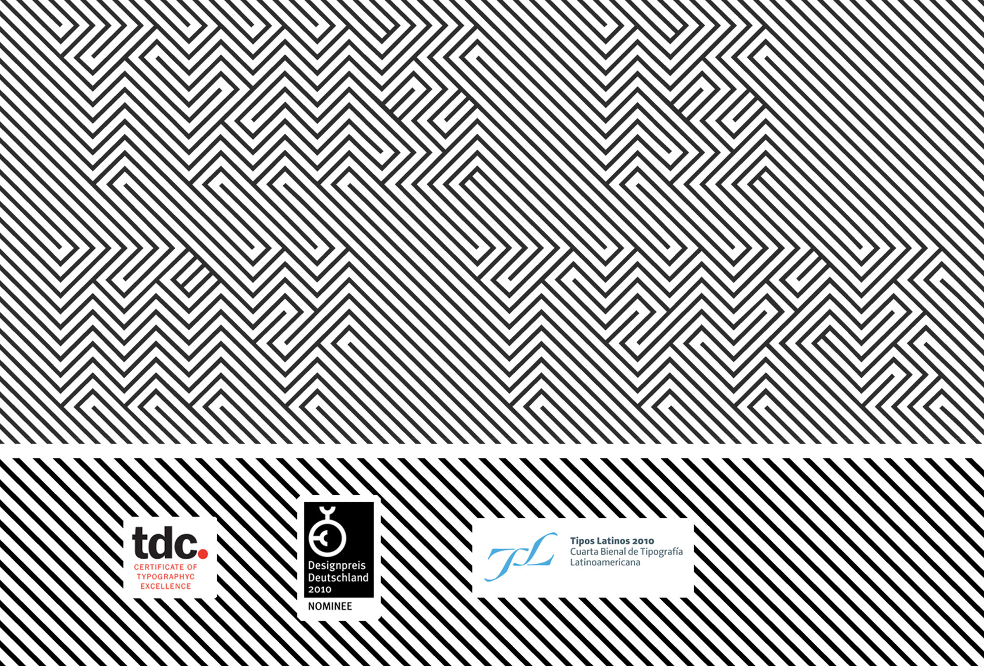
imagen rotatora
OPTICA NORMAL | November 21, 2008 |

OPTICA Normal is a typeface built with the help of orthogonal lines assembled together in a fixed order. In this optic game we can perceive a pattern texture but if you analyze the line directions you will see the text inside. This type performs better at large sizes.

OPTICA Normal is a tribute to the Colombian artist Omar Rayo´s optic art.

Project featured by Typographyserved.com

Download OPTICA specimen

[SP]
Optica es una fuente creada por Manolo G que tiene el propósito de ser usada en titulares mayores a los 100 puntos, por su forma es fácil de percibir a distancia.

El desarrollo de esta fuente está basado en el arte óptico de Omar Rayo, es un juego de trazos ortogonales que retan a la vista.

yes, OPTICA Normal in action

ver directorio FADU see warning

Share

No comments, Comment or Ping
  1. Elí

    Muy buena Manolo, se ve muy bien aplicada en ese cartel de Amnistía internacional. Vi óptica en ilovetypography.com Saludos :)

  2. Elí

    Muchas felicidades Manolo, ese premio del TDC está muy bien merecido! Enhorabuena!

  3. FERNANDO GARCIA

    Una cualidad de esta fuente, es el reto perceptual que obliga a la mente a visualizar el diseño de estos signos, desde otra perspectiva. Felicidades por tu contribución.

  4. Felicidades Manolo, en horabuena!!! Es en algunos momentos prácticamente imposible de leer, pero he ahi el encanto de enagañar al ojo.

    Abrazo amigo!!!

  5. wow donde la compro , felicidades nuevamente

  6. Excuse my English because I’m French …
    I am surprised because it happens that I created a few months ago typeface very very similar … can we talk about plagia? … I do not know…

    I draw in November 2008 for a poster (http://www.grapheine.com/blog/affiches/affiche-enghien-jazz-festival )

    My inspiration came from this image: http://www.at-elier.net/works/ailleurs/lovecraft/lovecraftaffiche01.jpg

    you can see my font here ( and download for free ! ) :
    http://www.grapheine.com/blog/typographie/typo-police-font-jazz-gratuite.

    I’m just disappointed not to have proposed to my typography to the TDC-2009 …

  7. Bluetypo

    Dear Mathias hello from mexico.
    I´m surprised too each time that I see a similar font to OPTICA Normal, below you can see the publish dates of OPTICA Normal and other projects that I found. I hope it can help you. If you are interested I can send you the font in OpenType to compare the seemed and differences. If I can help you, just tell me.
    why to talk about plagia?
    You can see the original post, there you can find more information.
    http://bluetypo.com/site/experimental/optica-normal/

    Regards
    Manolo G.

    1. Poster for 25th Habitat´s week
    http://bluetypo.com/site/cartel-social-cultural/25-semana-del-habitat/
    date: Sep 30, 2008

    2. OPTICA Normal Published on I Love Typography
    You can see on this link:
    http://ilovetypography.com/2008/11/28/the-week-in-type-good-type/
    date: November 11, 2008

    3. OPTICA Normal featured on Typography Served
    http://www.typographyserved.com/Gallery/OPTICA_Normal/152201
    date: November 27, 2008

    4. OPTICA Normal submitted on Behance Network
    http://www.behance.net/manologuerrero/frame/152201
    date: November 27, 2008

    5. OPTICA Normal featured on Typographic Investigations FADU
    http://www.it-fadu.org/fuentes_detalle.php?id=79
    date: November 14, 2008

    other projects similar:

    Dioptical font
    Typography Served house42 and featured on Typography Server
    http://www.behance.net/Gallery/Dioptical-Font/156252
    ceation date: September 23, 2008

    This is not by Heesun Seo
    Featured on Typography Served
    http://www.typographyserved.com/Gallery/This-Is-Not/153338
    date: Dec 18, 2008

    A2/SW/HK Design studio on UK
    http://www.a2swhk.co.uk/images/Eyes_Lies_and_Illusions_Exhibition-4_Hayward_Gallery_Scott_Williams_Henrik_Kubel_A2:SW:HK.jpg
    2004

  8. Bluetypo

    The reply from Mathias.

    hello, nice to meet you …
    i was surprise to see so much things similar…
    i discover “http://www.a2swhk.co.uk/images/Eyes_Lies_and_Illusions_Exhibition-4_Hayward_Gallery_Scott_Williams_Henrik_Kubel_A2:SW:HK.jpg” from 2004 ..
    before read your website, i don’t know Omar Rayo !
    internet is incroyable … some people have the same ideas in same periods …
    | why to talk about plagia?
    .. just excuse me ! …
    i was happy to receive your OpenType …

    Mathias

  9. Em

    Manolo, first of all congratulations for your award!

    I just wanted to add some details as concerning the Dioptical font you mention in your comment above
    http://www.behance.net/Gallery/Dioptical-Font/156252

    The font is by house42 (not Typography Served) and was created with FontStruct
    http://fontstruct.fontshop.com/fontstructions/show/dioptical

    From the creation date you can see that it was created on September 23, and it was shared (made public) on FontStruct, our blog and the Behance network in December.

    It’s really amazing how different people have similar ideas in the same period, I just can’t explain why.

  10. Thanks EM for the observation. I did the correction.

  11. Felicidades, Manolo, muy interesante tu letra y merecido el premio. Un saludo desde el DF. Gabriel.

  12. [...] hat diesen Displayfont als Ehrung an den kolumbianischen Künstler Omar Rayo entworfen. Achtung, „Optica Normal“ kann zum Knick in der Optik [...]

  13. [...] Optica Normal es una tipografía experimental en la que cada letra está compuesa por líneas ortogonales formando una especie de laberito. En realidad produce un efecto óptico en el que, mirando de lejos la imagen, pueden leerse las letras. No es precisamente un prodigio de la legibilidad –está pensada para leerse «a distancia», en tamaños de más de 100 puntos– pero definitivamente es una idea original y curiosa. Es una trabajo de Manolo G, en homenaje al arte óptico de Ómar Rayo. [...]

  14. [...] Optica Normal es una tipografía experimental en la que cada letra está compuesa por líneas ortogonales formando una especie de laberito. En realidad produce un efecto óptico en el que, mirando de lejos la imagen, pueden leerse las letras. No es precisamente un prodigio de la legibilidad… Seguir leyendo: http://www.microsiervos.com/archivo/arte-y-diseno/optica-normal.html Leave a Reply Visited 1 times | [...]

  15. [...] con efecto óptico de serie En la imagen de la izquierda pone “Una fuente” escrito con Optica Normal una fuente un poco extraña. Si no podéis leer el texto en la imagen probad a alejaros de un poco [...]

  16. [...] El experimento se llama Optica Normal. [...]

  17. Victor M.

    Felicidades Manuel, yo también vi óptica en ilovetypography.com.

  18. Miguel Ángel Padriñán Alba

    Muchas felicidades, lo que ha logrado, muy pocas personas en México lo han logrado y es motivo para presumirlo y principalmente, motivo para difundirlo entre los colegas.

  19. Neu

    Primero que todo, felicidades por el premio. Me gustó mucho el trabajo con Optica Normal y me interesaría adquirirla… pero al parecer no está a la venta o no puedo encontrar dónde comprarla…

  20. Bluetypo

    Hola, sobre Optica Normal, estará disponible a través de myfonts.com en unos días. Te aviso en cuanto esté lista. saludos.
    Manolo G

  21. Bluetypo

    OPTICA normal y negativa están disponibles a través de myfonts.com por solo $29.90 por lanzamiento.

    http://new.myfonts.com/fonts/cocijotype/optica/

  1. Type Directors Club 2009 - Feb 19th, 2009
Reply a “OPTICA NORMAL”